Designing a gamified rewards system to drive in-store revenue
Led the design of an omnichannel rewards experience that intersects between the digital and physical world to increase in-store shopping frequency and drive business growth.
Role
Lead Product Designer
Collaborators
1 Product Designer,
2 Product Managers,
2 UX Researchers, Product Ops, COO
Timeframe
3-4 months
My Contribution
As the Lead Product Designer, I connected business strategy with real customer needs by facilitating workshops with stakeholders. I conducted hands-on user research that shaped the experience strategy, mapped how the solution would integrate into the existing ecosystem, and defined how it could scale from MVP into future opportunities. Alongside this, I led and coached a Senior Product Designer in execution of the interaction and visual design.
Summary
Background
FairPrice's digital strategy shifted from digital-only to omnichannel experiences in order to drive business growth.
Goal
Help value-conscious shoppers discover deals and increase frequency of shopping to drive in-store revenue.
Solution
We designed a QR code scanning reward mechanic that customers would scan at the entrance of a store to receive a daily exclusive rewards. Please see the prototype video of the final solution below.
Results and impact
Rolled out across all 165 stores, Scan For A Daily Surprise became a core omnichannel engagement tool and later enabled supplier-funded campaigns, retail media, and in-aisle QR activations.
400,000
weekly scans
$3.7M
incremental monthly sales
12%
of total sales in top stores
+3pp
month-over-month adoption
Scroll down to see the full process
A Bold but Ambiguous Start
FairPrice was undergoing a transformation
Our team was expanding its scope from digital-only to omnichannel experiences. With new leadership came a renewed ambition to reimagine how customers derive value across all channels.
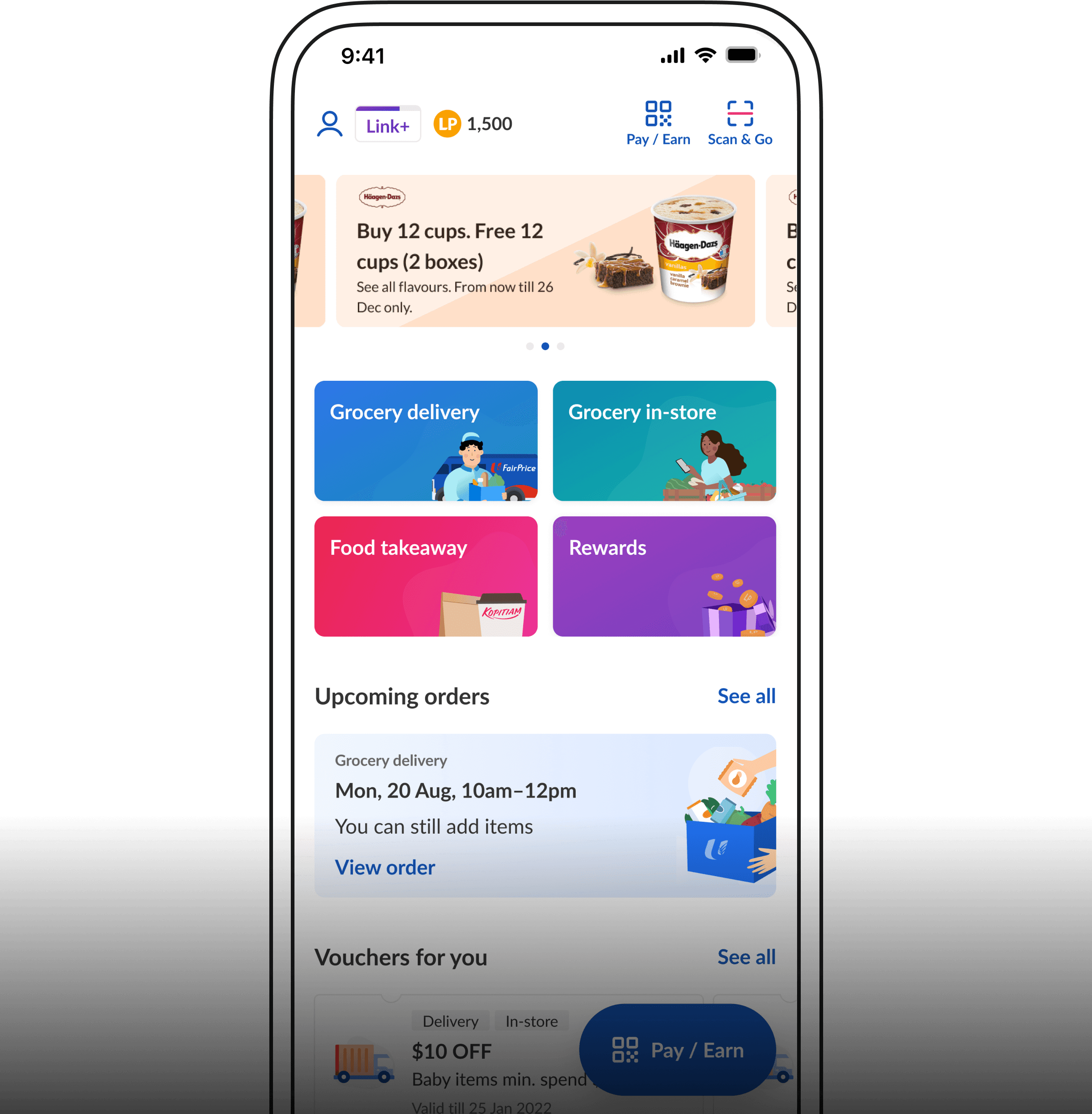
It started out as a call to redesign the homepage
Beneath that seemingly straightforward goal, there was confusion. Every team had a different interpretation of what that meant. Priorities were misaligned, and discussions quickly became fragmented.
Untangling the Chaos
But the goal was to drive engagement
I partnered with my PMs to clarify that the goal was not a cosmetic redesign but to increase in-store shopping frequency through digital engagement. We aligned this through interviews with the Chief Omnichannel Officer and various stakeholders.
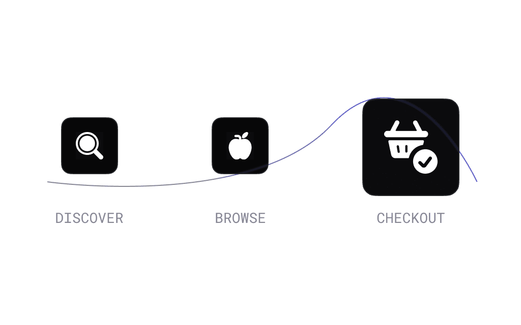
If we wanted to change this behavior, we would need to shorten the "time-to-value"
Engagement spiked at checkout
App data showed that most in-store shoppers only engaged digitally at checkout, using vouchers before paying with FairPrice Pay. This was too late in the journey to influence decisions or drive discovery.
We knew our frequent shoppers were value seekers
Our research showed that digitally engaged customers were strategic, value-driven shoppers. They logged in every Thursday for new deals and typically bought several items within days.
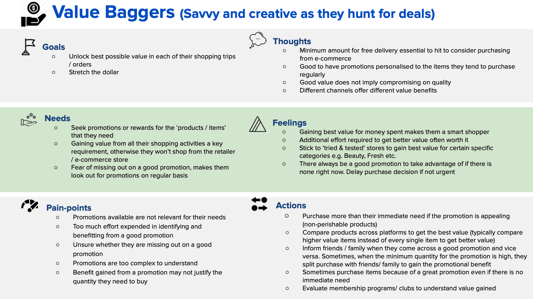
The customers we were building for
Reframing the challenge
How might we help value-conscious shoppers discover in-store deals earlier in the journey to increase frequency of shop?
Exploring Concepts
Scouring the competitive landscape
To inspire solutions, I worked with the Senior Product Designer on my team to do a competitor landscape study.

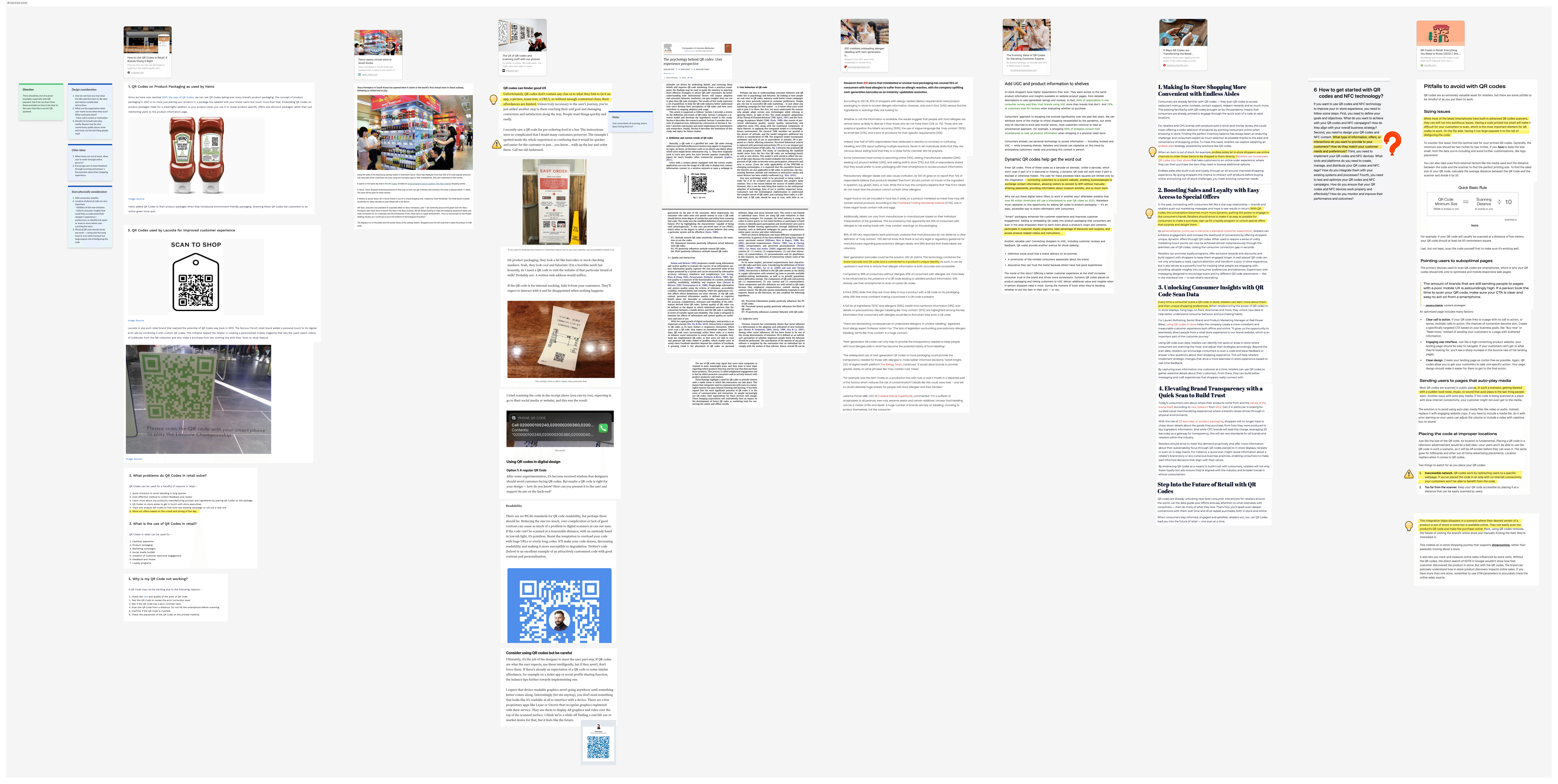

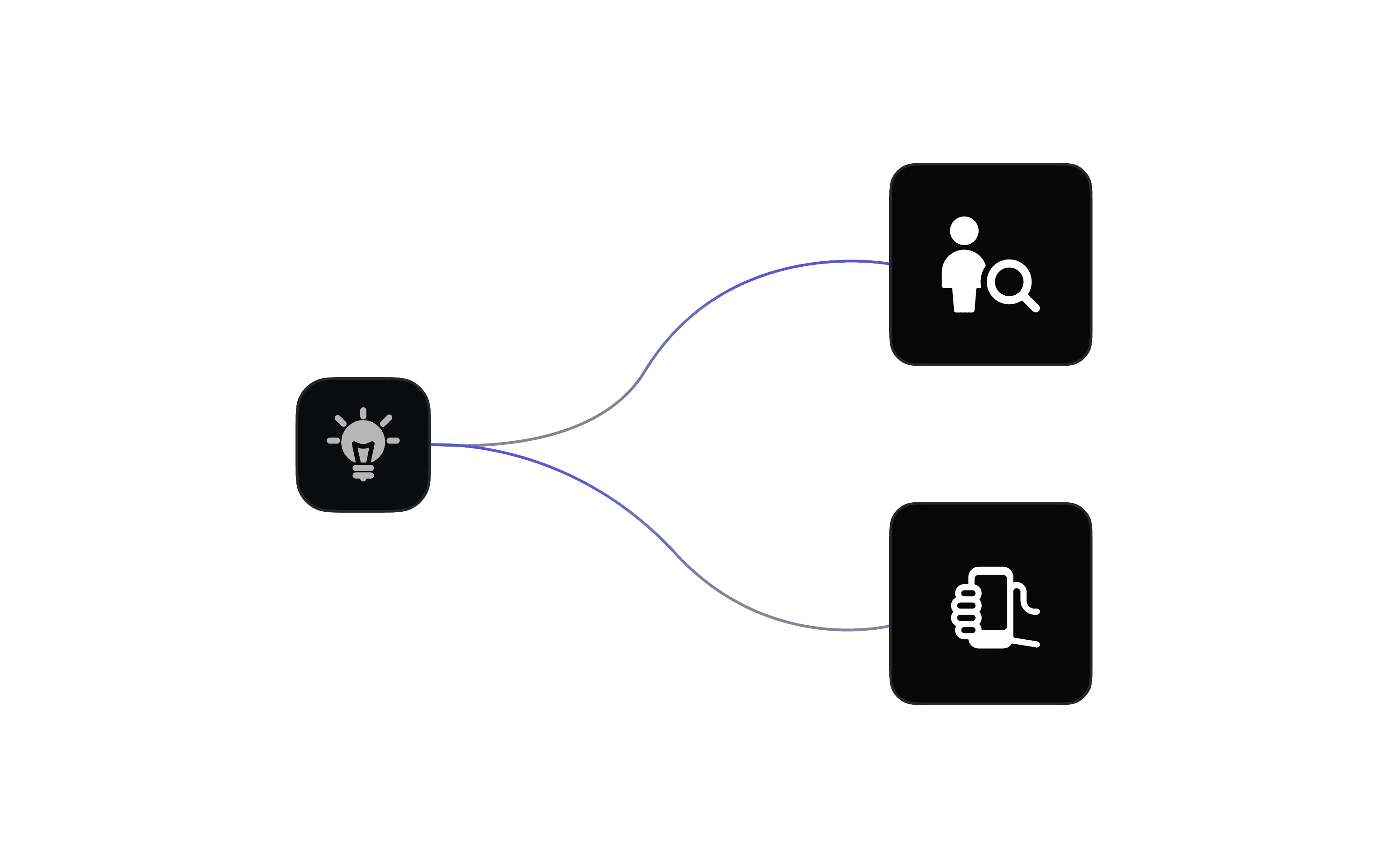

Two solutions emerged
Self-discovery:
Surface nearby store deals on app launch.
Interactive triggers:
Use a QR scan at the entrance to unlock rewards.

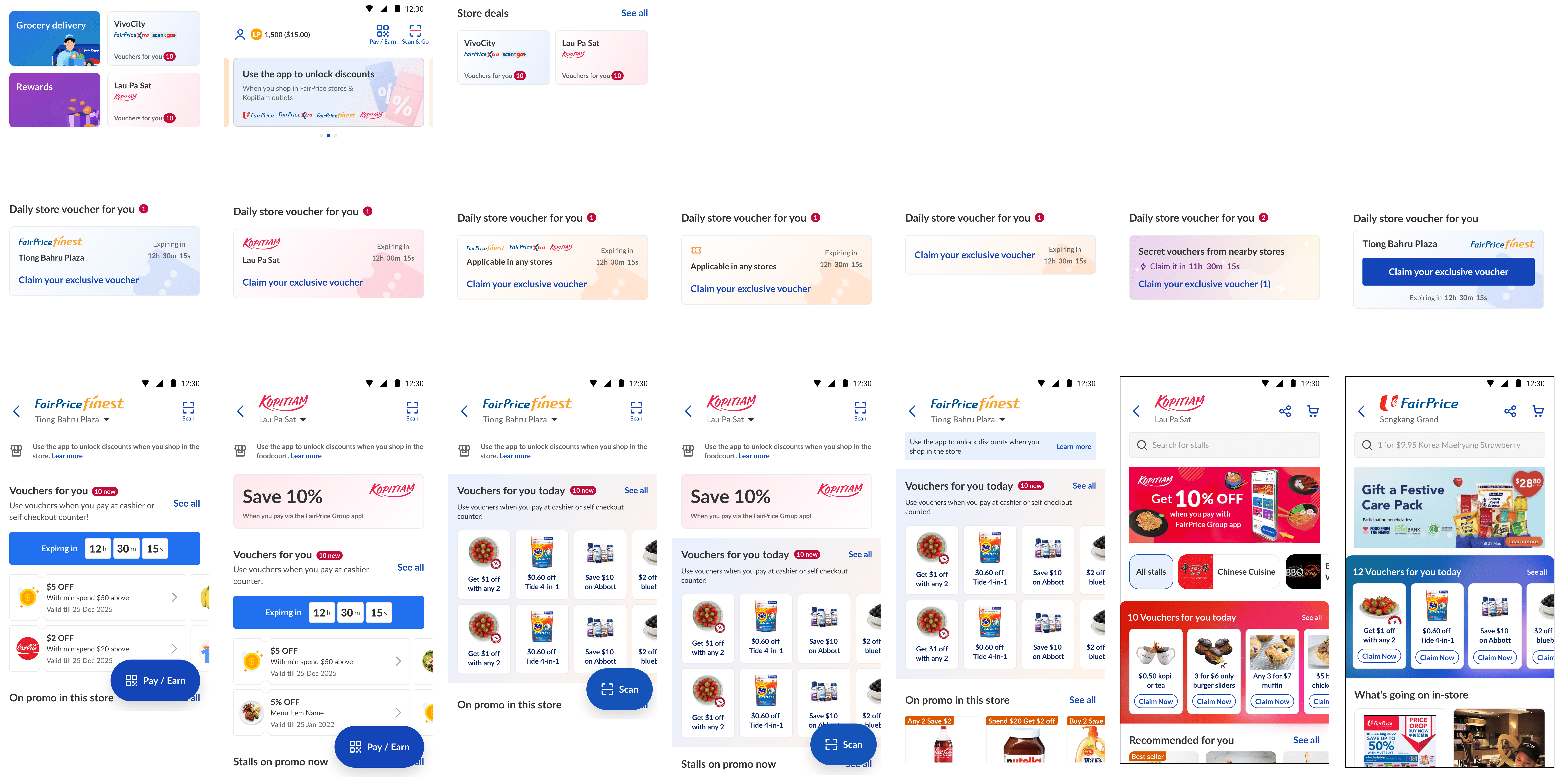
A version of the self discovery solution

A version of the in-store trigger based solution
We explored many different variations
Our explorations were divergent in visual, interaction and content design. Quickly generating many ideas enabled us to eliminate what would not work for our context.

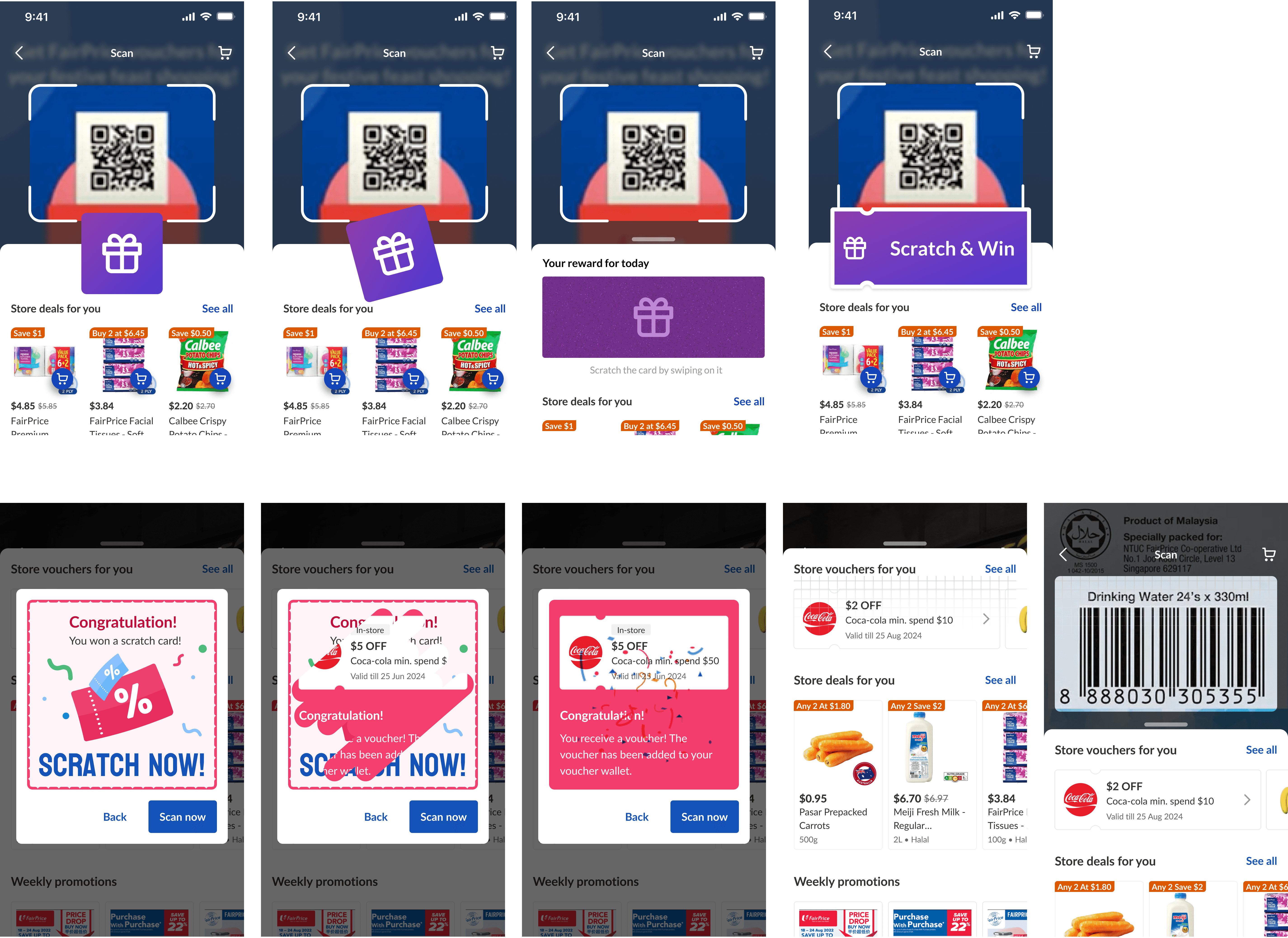
Testing to converge on the direction
We ran a quick concept test with 8 participants to help us narrow down on the direction we should take. The findings were decisive:
Finding 1
Without a physical trigger, customers would likely forget to check the app for deals.
Finding 2
Simply showing vouchers on the app felt confusing and disconnected. Users assumed they were only for online purchases.
Finding 3
There was no sense of delight in just browsing static vouchers.
The physical trigger of scanning a QR code, on the other hand, created anticipation and a tangible reason for customers to open the app.
Prototyping
We decided on the QR code solution
This mechanic also unlocked future opportunities like product barcode scans for brand vouchers, supplier-funded campaigns, and festive store takeovers.
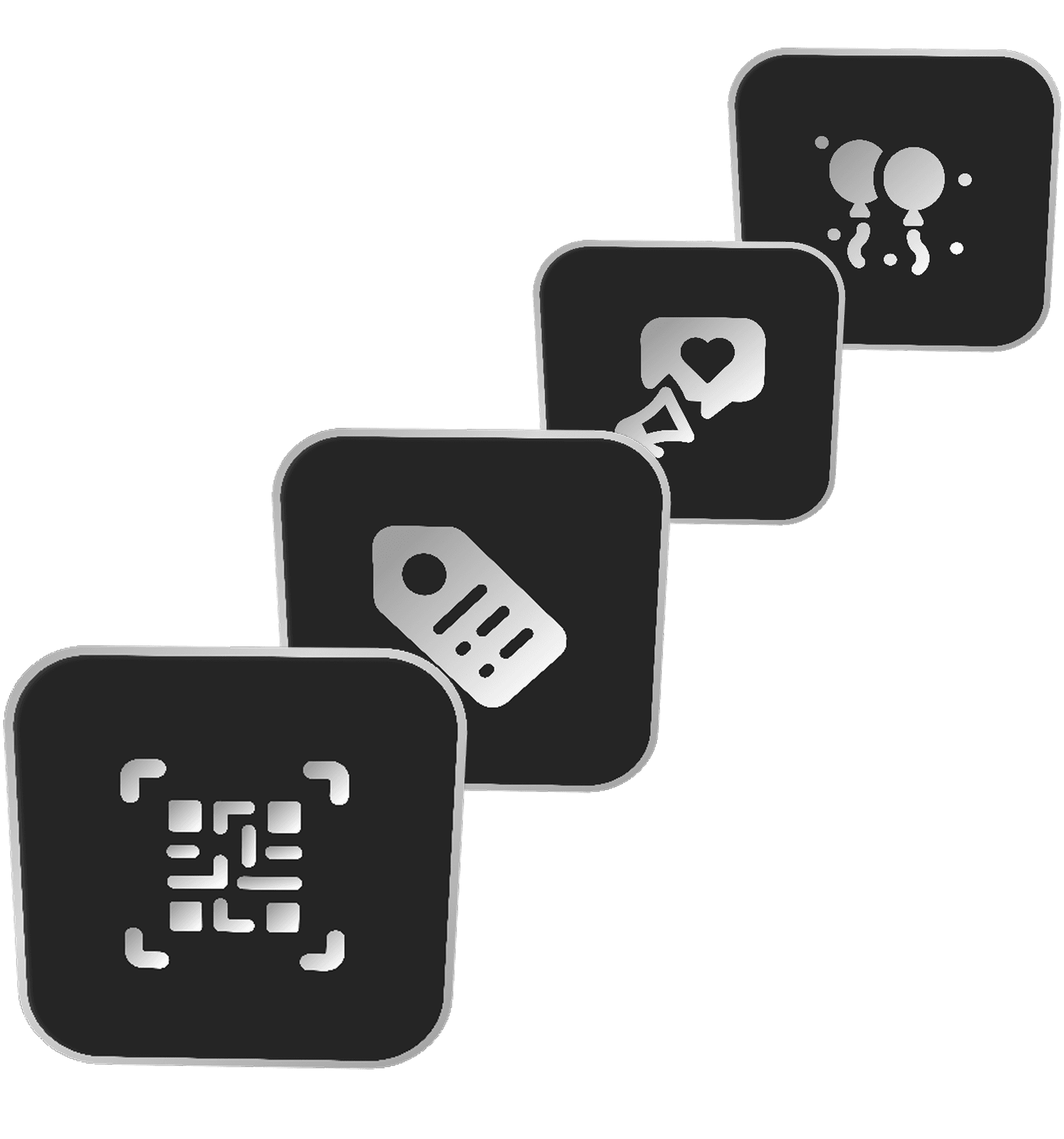
QR code solution could easily be scaled up to barcodes, brand and festive campaigns.
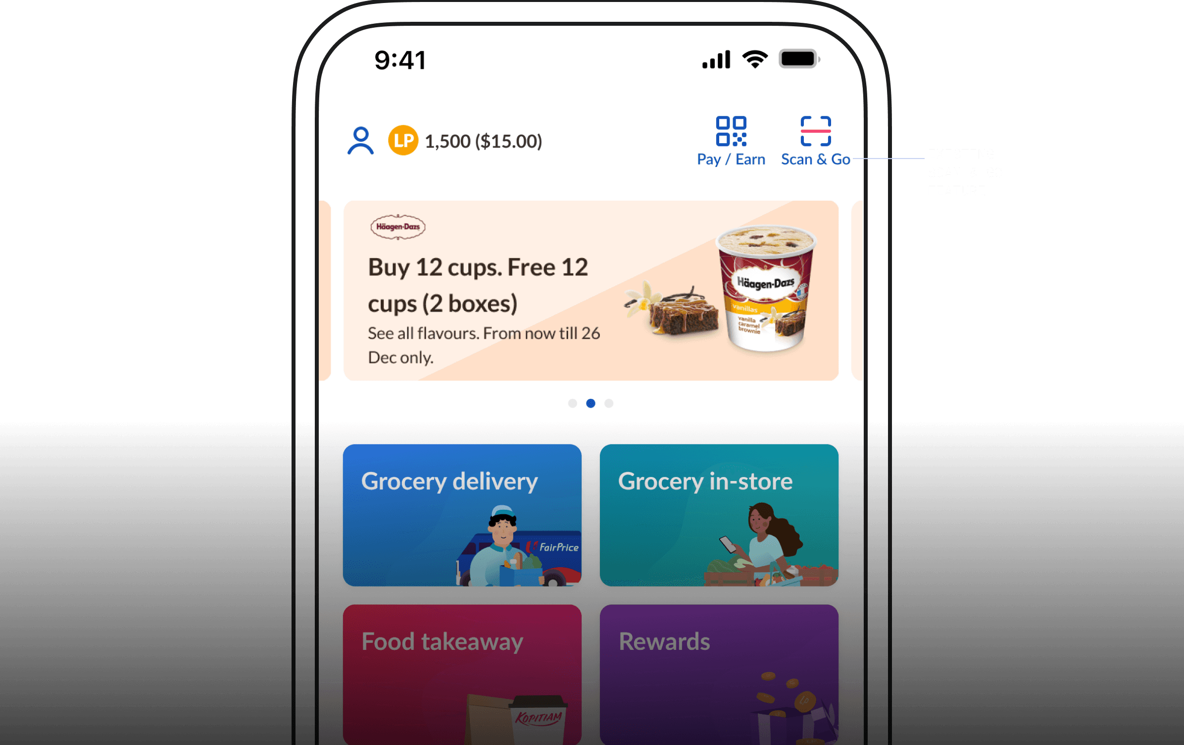
Integrating in to the product
The challenge was integrating this into the existing ecosystem without disrupting what worked. We had a feature called Scan & Go in place. We would need to introduce the new mechanic without confusing existing users.
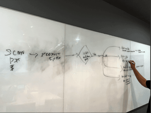
I worked with my engineering and product peers to map out how we would integrate the new scanning feature without hurting the existing experience that many loyal users were fond of.
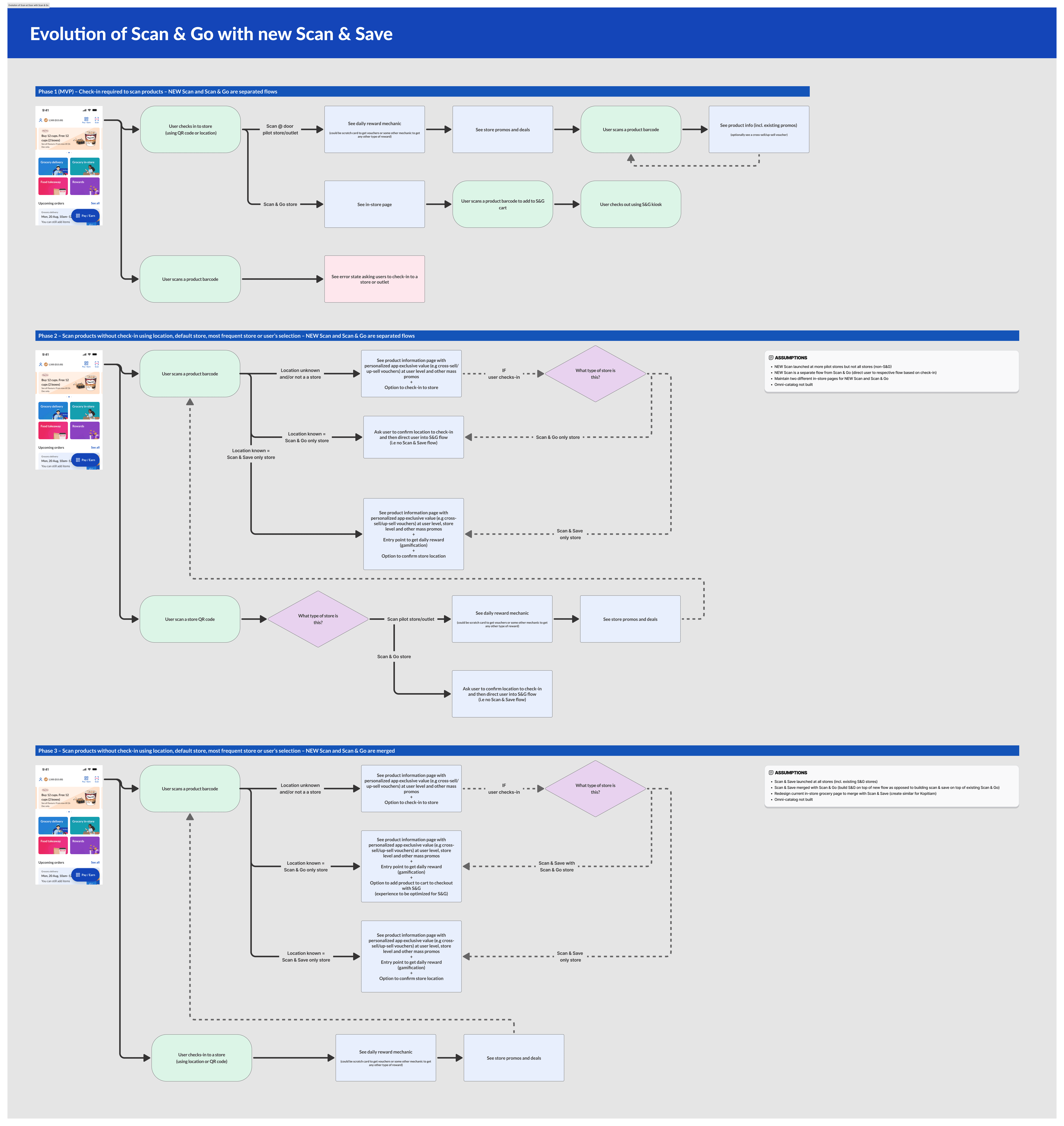
I explored the how we scale the feature to fit into current and future use cases. We defined three phases of the product: entry scans, in-aisle scans, and supplier or campaign activations.
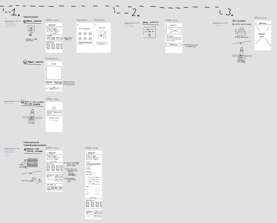
We sketched out the future use cases for product barcode scanning as well and decided to prototype and test it so that we could better informed of what is actually valuable for customers and what could be the minimum viable product (MVP).
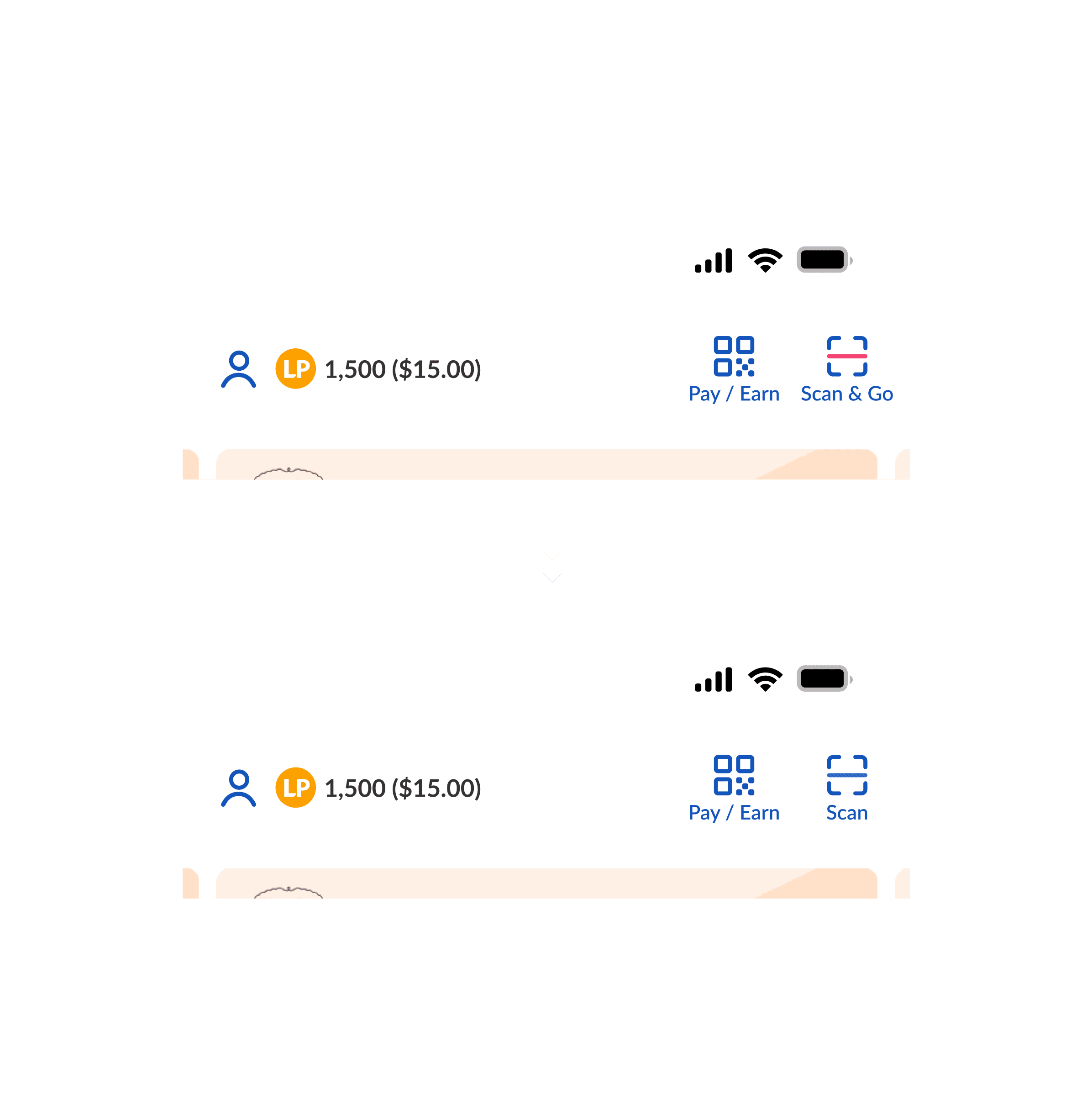
A simple change to balance future and existing needs
After having mapped out all the flows and future use cases of scanning, I made the design decision to unify everything under a single entry point “Scan.”
Testing
Putting our ideas to the test
With the core flows in place, we began testing to validate both the digital experience and in-store touchpoints. We ran three test tracks: scanning at entrance, scanning products while shopping, and in-store POSM communication.
The prototype flow that we tested
Testing scan at entrance solution
I worked with the UX research team to plan the study, recruit participants, and choose test locations. We ran in-store usability tests across two store formats with regular shoppers, including both Scan & Go users and non-users.
We wanted to understand two main things:
1) How easily customers could discover and use the scan mechanism, and
2) How relevant or exciting the reward felt once they did.
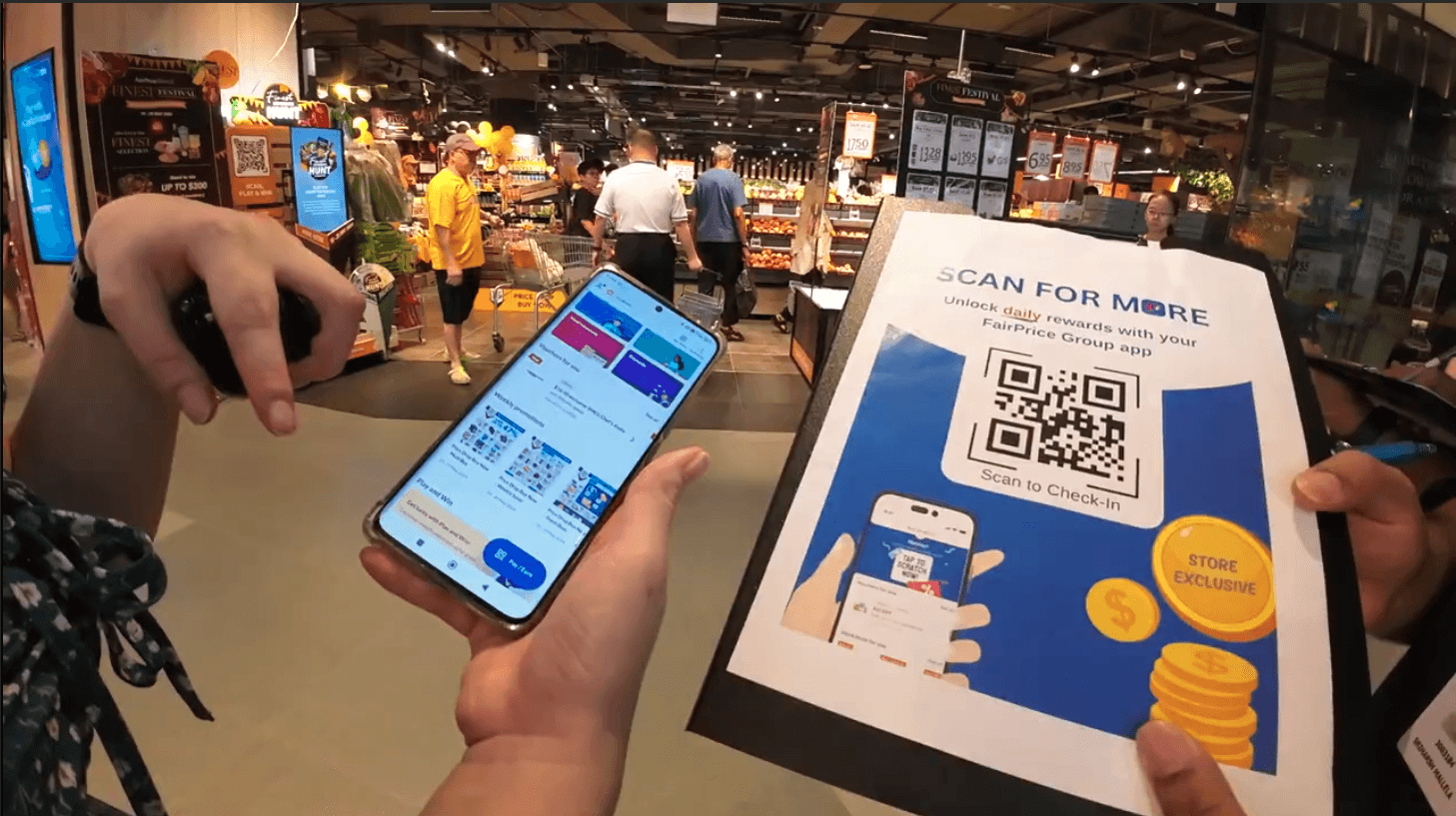
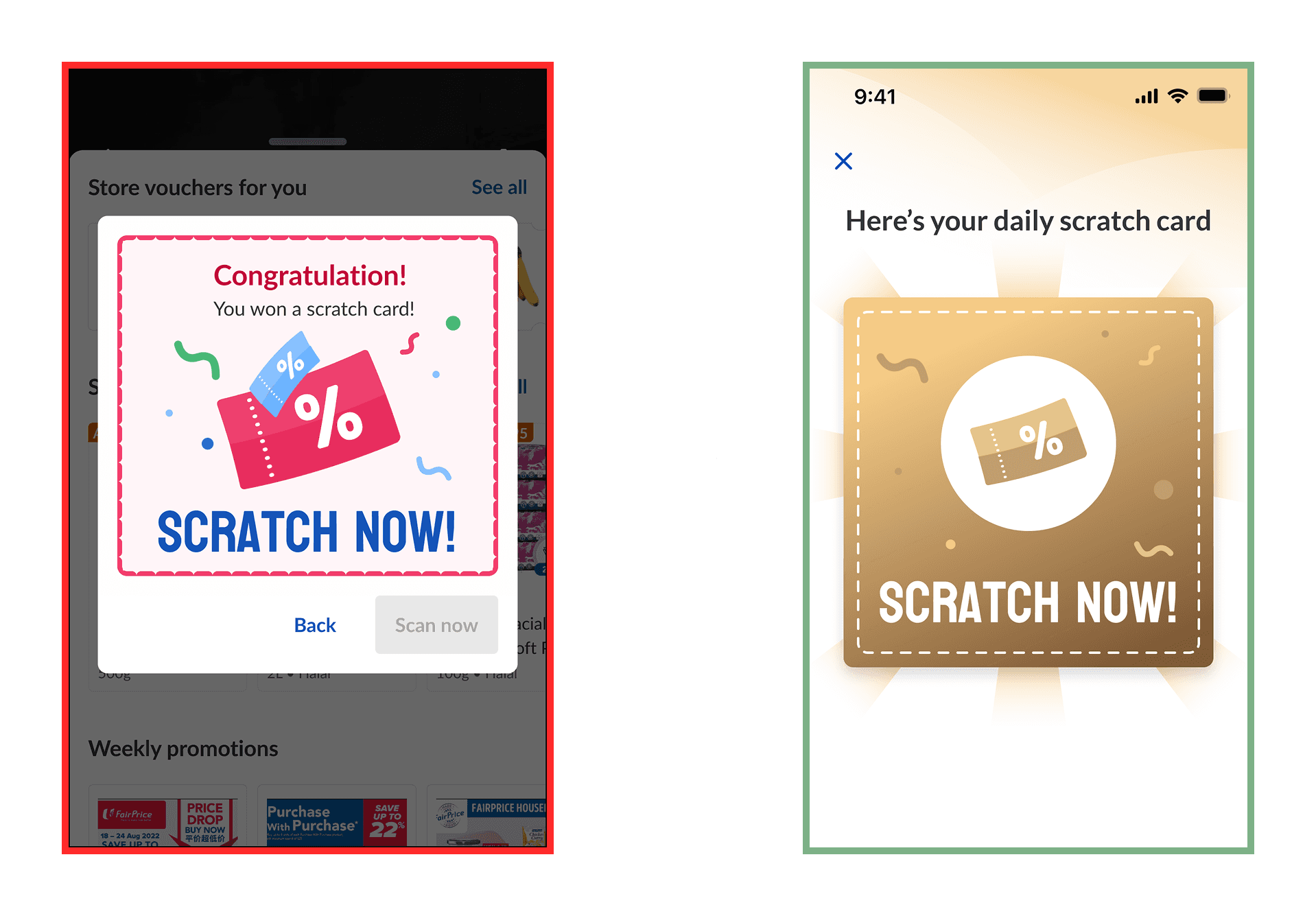
Scratch card was the key delight factor
We simplified the interface to keep it focused on the scratch card and redesigned the visuals as such that it felt more like a valuable golden ticket which worked well for our Singaporean customer base.
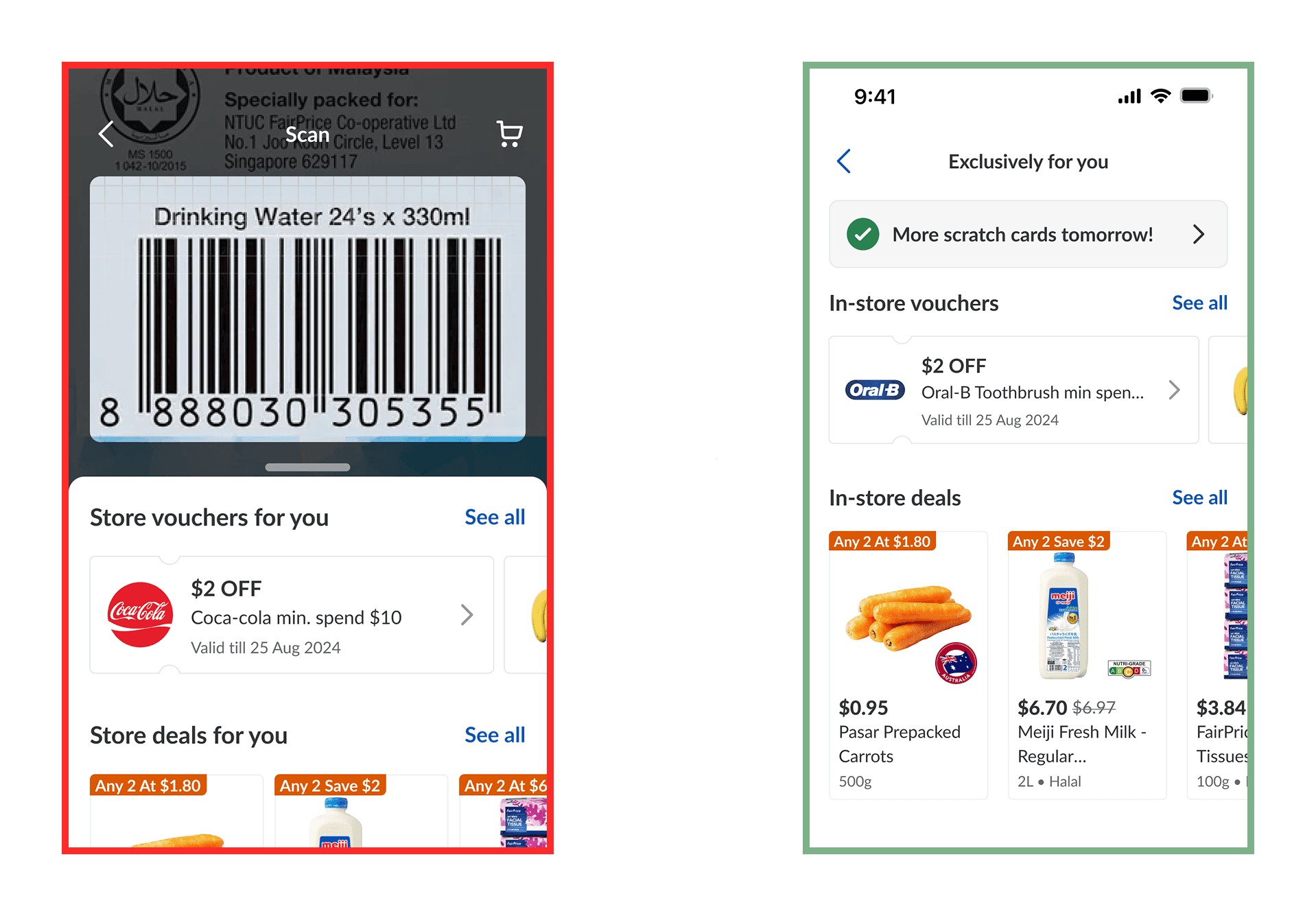
The continuously present scanner got in the way
Customers didn’t want to keep scanning; they just wanted to shop. We simplified the flow and made the earned voucher instantly visible, giving shoppers confidence they could use it at checkout.
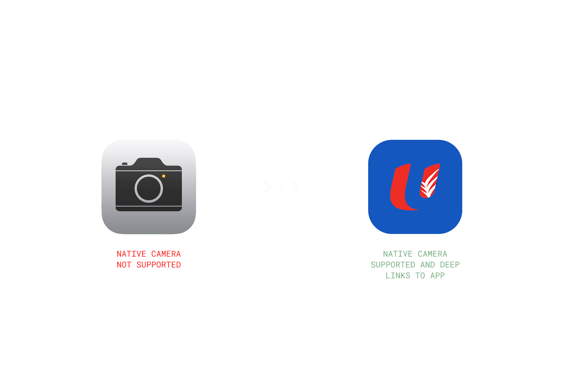
People instinctively used their phone's camera
People defaulted to using their phone’s native camera, a habit formed during Covid SafeEntry check-ins. This led us to add deep-linking so the FairPrice app would open seamlessly from the camera.
Distrust in unofficial QR codes
Some were unsure if the QR codes were official, expressing concerns about scams. Branding QR codes clearly to build trust and a sense of safety was crucial so we refined the design of the in-store POSMs.

Testing other uses cases of scanning
Next, we explored how to extend scanning behavior beyond the store entry point. These sessions focused on concepts such as scanning a product barcode, aisle, or brand QR code to unlock deals or content while shopping.

Testing other scanning concepts in-store
Finding 1
Shoppers were deeply focused on their physical shopping tasks, picking products, handling trolleys, and navigating aisles. Most found it inconvenient to continuously use their phones.
Finding 2
The only moments when customers were willing to scan were those tied to clear and immediate benefits, like a chance to win a scratch card or receive a discount for a particular product.
Finding 3
Scanning for information alone, such as reviews or product details, didn’t appeal much to grocery shoppers. However, scanning for a reward, even a small one, significantly boosted motivation.
This formed a clear design principle: scanning should be anchored around tangible rewards, not passive information. It also led to the principle of introducing “Scan-to-Gain” mechanics for future campaigns, where each scan unlocks a clear value exchange.
Testing in-store communications
Since much of the discovery for this feature depended on physical signage, we ran a separate round of testing focused solely on the point-of-sale materials (POSMs) used at store entrances.
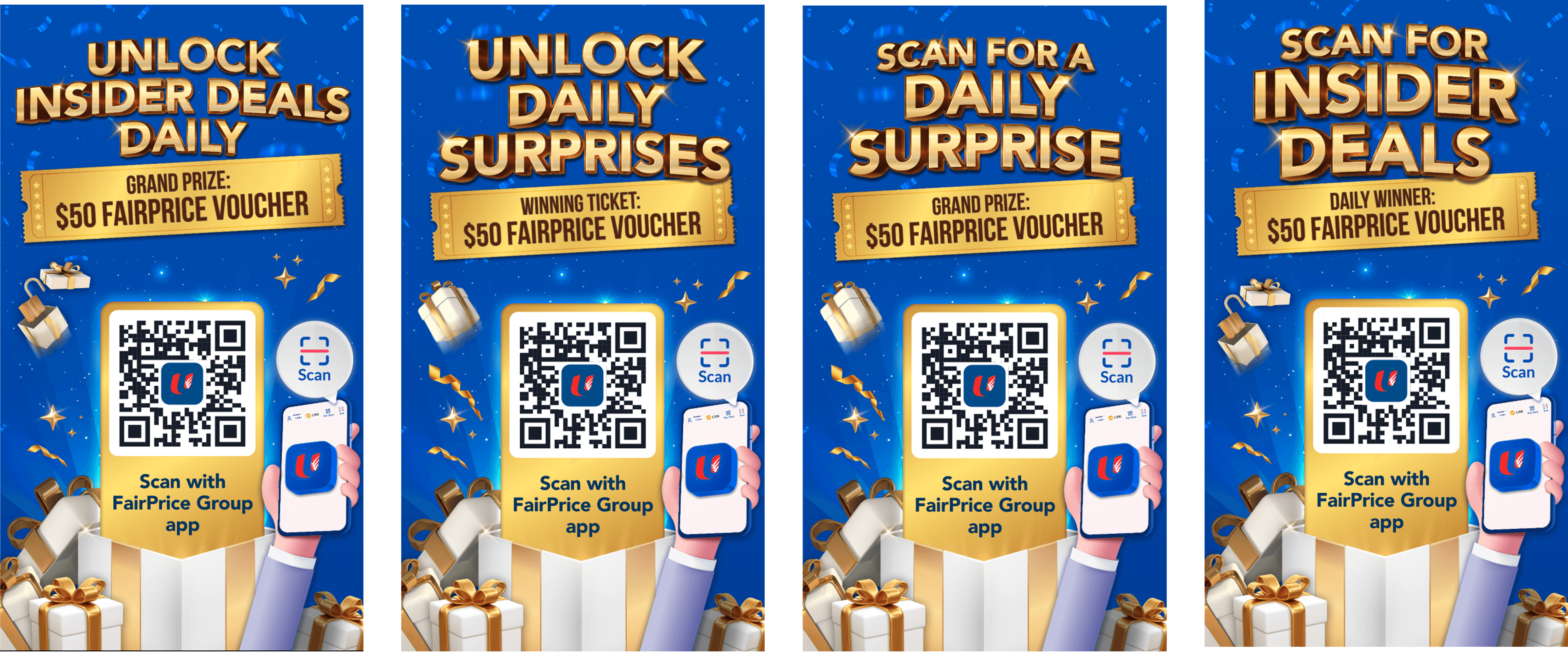
We tested multiple headline variations: “Scan for a Daily Surprise,” “Unlock Insider Deals,” and “Scan & Win,” to identify what best caught attention and conveyed the right message.
Finding 1
“Scan for a Daily Surprise” resonated best across demographics. It was simple, action-oriented, and conveyed immediacy.
Finding 2
The use of “Insider Deals” sounded too transactional. The messaging needed evoke a feeling of surprise and reward.
Finding 3
Customers also preferred visuals that looked official, celebratory, and credible, with prominent FairPrice branding and simple steps.
Results
Final solution
We took our learnings form the three different rounds of testing and decided to launch with only the scratch card reward mechanic. The other use cases had no clear customer value just yet.
The final, simplified MVP solution
Impact and scaling
We ran a pilot across 11 stores of different formats. The results exceeded our expectations and drove rapid scaling. By June 2025, Scan For A Daily Surprise had expanded to all 165 FairPrice grocery stores. It became not just a gamified reward mechanic but a new engagement channel that bridged online and offline experiences.
400,000
weekly scans
$3.7M
incremental monthly sales
12%
of total sales in top stores
+3pp
month-over-month adoption
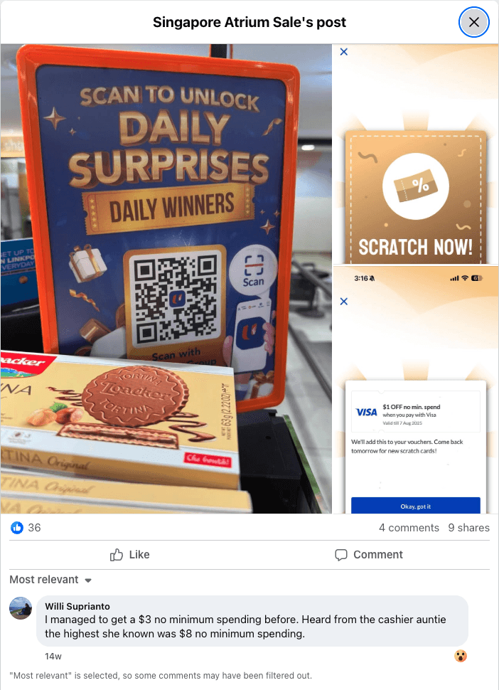
Customers sharing about this online
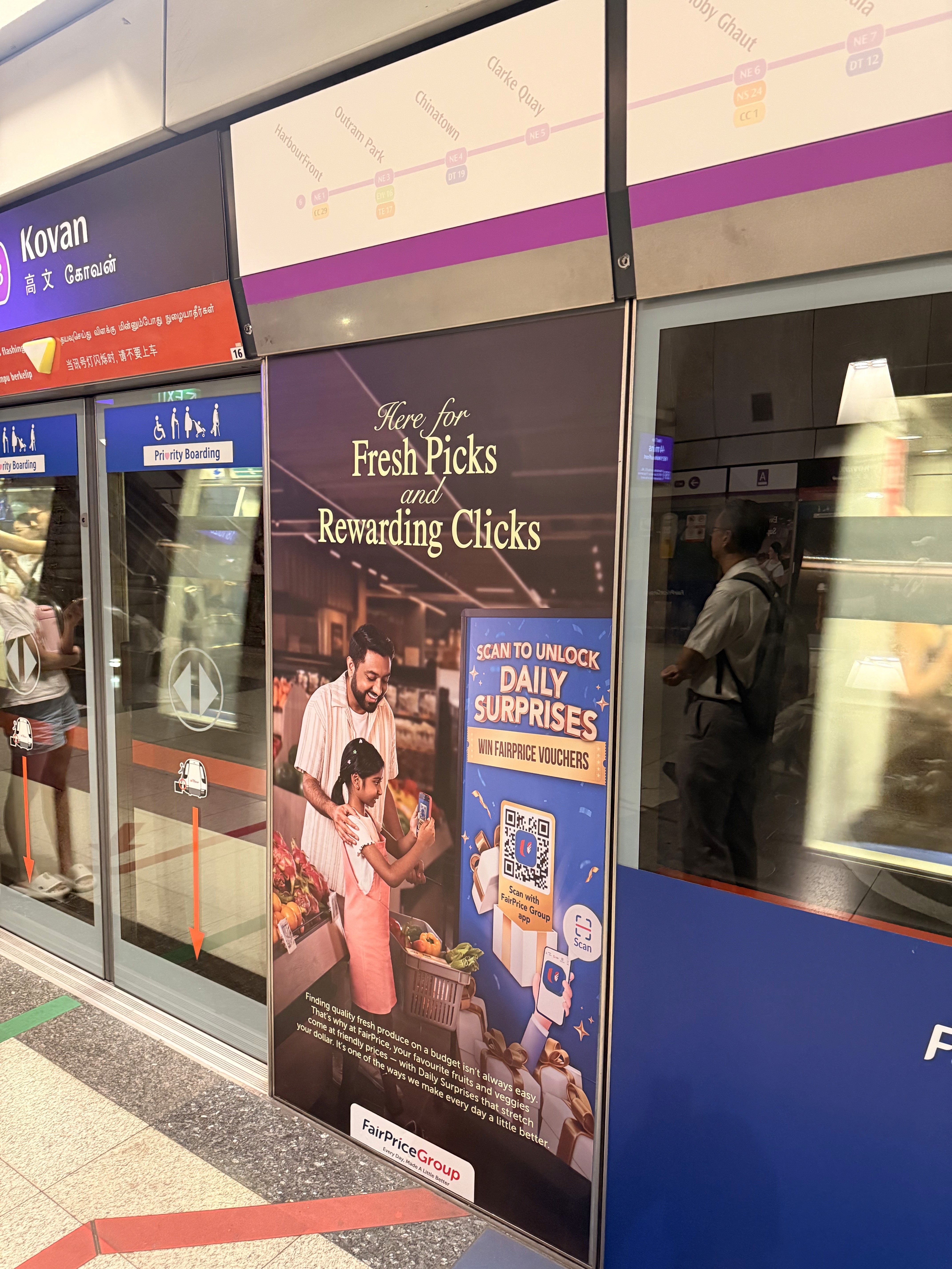
Part of nationwide campaign on trains
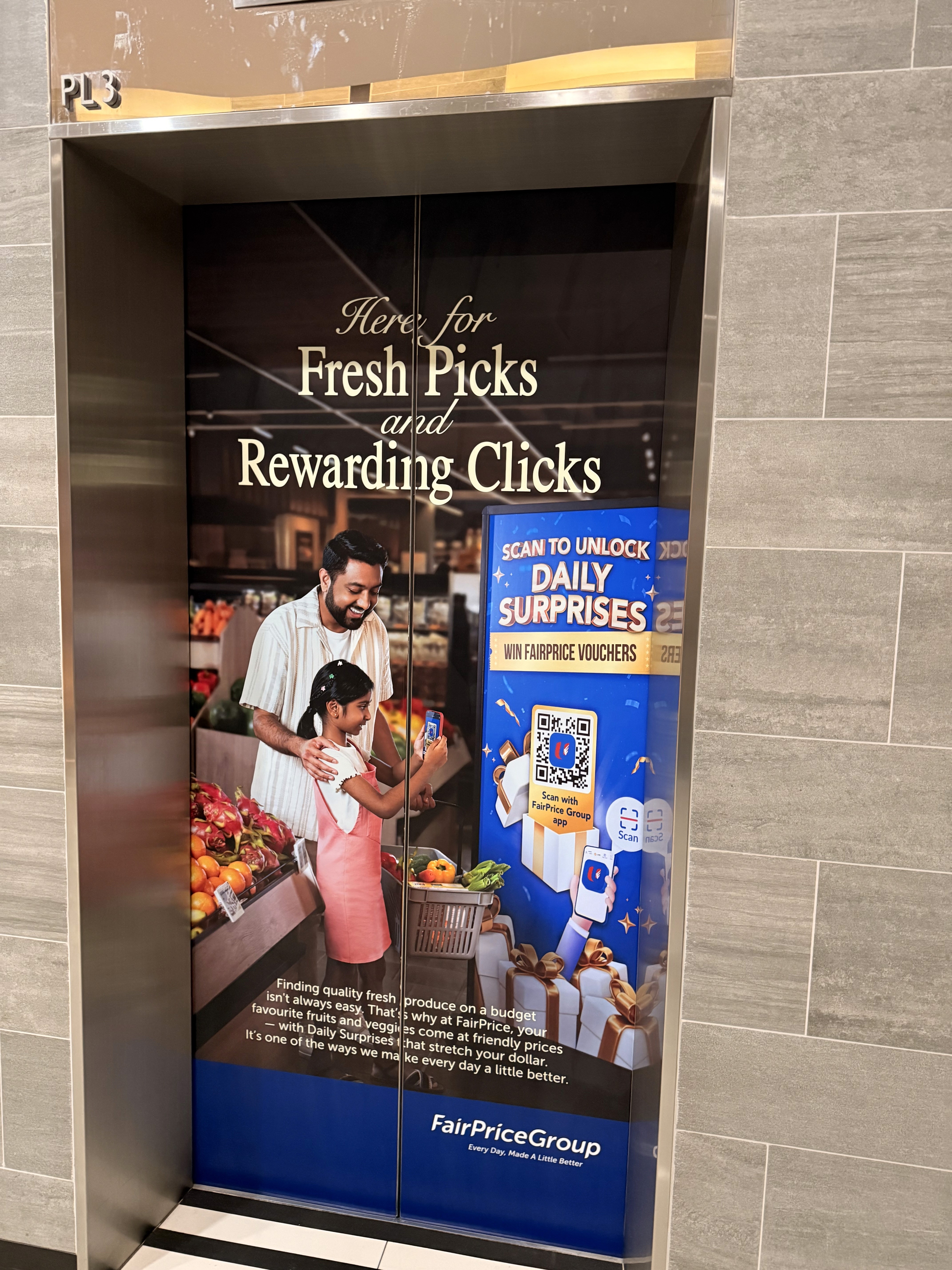
…and elevators
Beyond its original goal, it also became a foundation for supplier-funded campaigns and retail media monetization, extending to in-aisle QR activations and brand partnerships.
Reflections
This project was more than a feature. It reframed how we think about in-store engagement. It was no longer about static posters or loyalty points but about dynamic digital moments. Through rigorous testing and iteration, we built something that delighted customers, delivered measurable business impact, and laid the groundwork for future omnichannel engagement.
Design is not only about polished visuals. It's about getting clear on the customer need and anchoring every decision to a measurable business goal.
This project taught me that impact does not always come from bold or flashy ideas. Simple ideas, when grounded in real behavior, can move numbers in meaningful ways.
The breakthrough here came from connecting clear customer motivations with a focused commercial objective.
Designing omnichannel experiences requires constant testing and observation. It reinforced how important it is to understand real environments because small context shifts can break even the best designed flows.
What I would do differently
Spend more time polishing the navigation of the flow to smoothen the experience and integrate it better in the product
Redesign the flow slightly so as to reuse some existing pages that had similar content instead of creating new pages
Work more closely with store operations so that we could provide even better store specific deals and useful information for customers
View on larger screen size to view the full case study
View on larger screen size to see the full case study